Verdure / A shared design language
Craft in the details.Comfort in the familiar.
Botanical rhythm from Morris verdure tapestry. Quiet structure, warm materials, and precise finishing inspired by heritage leatherwork and travel trunks.
01 / The palette
Parchment
#F2EDDF / Background
Forest
#304E41 / Brand forest
Sage
#A7B298 / Illustration
Madder
#8A5149 / Links / emphasis
Antique gold
#AD915B / Stitch / detail
Slate blue
#536C73 / Secondary art
02 / Type & material
Thoughtfully woven.
- Playfair Display / editorial headings
- Inter / website text and controls
- System font / native applications
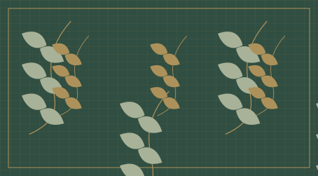
Use cloth texture in illustrations and app identities. Keep reading surfaces calm.
Take inspiration from materials and craftsmanship; use original motifs and initials.
03 / Native by default
The platform sets the manners.
KDE apps use Kirigami and Qt Quick Controls, system fonts, system colors, and familiar actions. Apply Verdure to icons, welcome art, and content—not forced toolbar colors.
Other platforms
Respect window chrome, menu placement, shortcuts, focus, dialogs, and light/dark preference. Web wrappers should feel at home; validate each platform separately.
Interaction & accessibility
Clear focus rings. Labels beside unfamiliar icons. Keyboard access throughout. Quiet motion with reduced-motion support. Never place texture behind working text.
04 / App icons as woven emblems
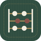
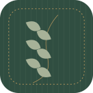

- One clear metaphor. A shared stitched edge. Two to four muted colors.
- Cloth grain is a subtle accent; the silhouette must work without it.
- Design at 48 px, expand to 128/256/512; simplify at 16/22/32.
- Use system symbolic icons inside toolbars.
05 / Website implementation
Server-rendered React: /, /projects, /design, /about. Render content and links on the server; hydrate interactive controls as needed. Fetch public GitHub data server-side and cache it. Use semantic landmarks, real links, useful page titles, responsive images, and locally hosted fonts.
Layout: 1440 px desktop canvas, 1296 px content, 72 px margins. Below 768 px: one column with 24 px gutters; portrait follows the introduction and actions. At 768–1199 px: two columns where space allows. Keep body text near 65 characters per line. Home flows from vision to areas of focus to work in development.
Primary text / #263E35. Use forest and parchment for the website; native apps follow the user’s system theme.